

Website Redesign
Pinnacle Engineering

Simplifying A Complex Business
Met with client to discuss website goals, concerns with their existing site, issues that users are having, and how to build their website to address everything.

New Brand, New Design System
Using Pinnacle’s new branding, established web style guide and standards including typography, colors, buttons, button interactions, spacing, and components.

400% Increase in Users
After the website was launched, we saw an over 400% increase in users, an 8.2% increase in engagement time, and a 6.6% increased rate of engagement.
Tools Used
Adobe XD
Figma
Google Analytics
User Research
User Analytics
UX Design
Information Architecture
Content Strategy
Mockups
Visual Design
Creative Direction
Style Guide
Mobile Design

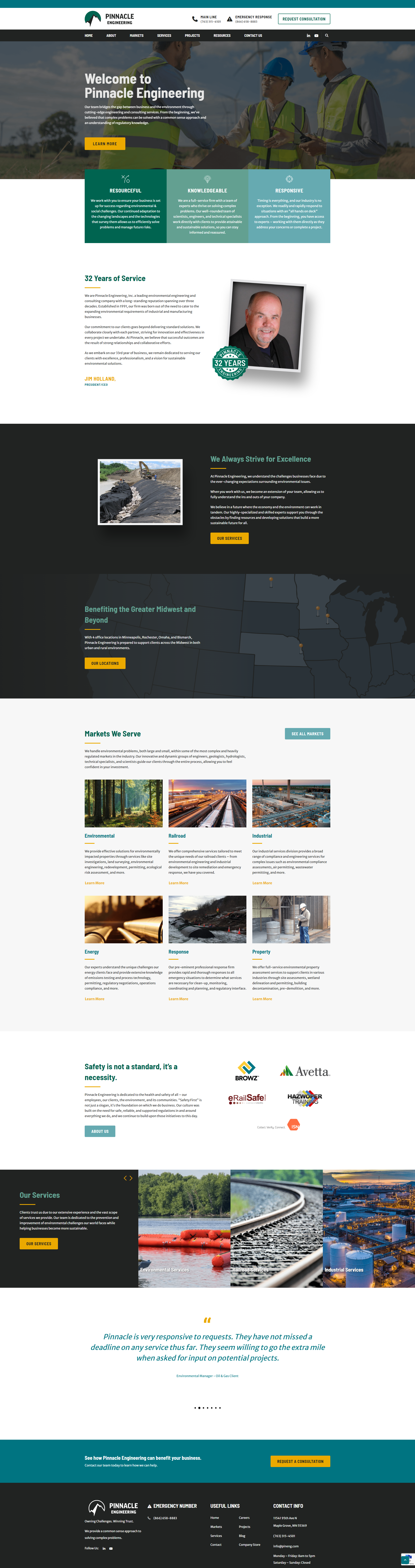
Engineering a Website for Growth and Thought Leadership
Pinnacle Engineering is an environmental engineering company that helps clean up oil spills, surveys land for construction projects, and recently began using drones to help with their work.
As the UI/UX Lead on the project, I met with the client to discuss their business goals and where they feel their website falls short. I was in charge of the entire design process including: UX strategy, information architecture, visual design, mockups, and design QA.
The primary goals for the redesign were to:
Position PE as an expert and thought leader in their field
Showcase their projects in a more visually appealing way
Attract young talent to their Careers page
Expand their Services and Markets pages
Showcase their new branding and standardize their website styles
Creating The Blueprint for The Website
The biggest changes I made to the Pinnacle Engineering’s sitemap was to break out all Markets and Services to have their own pages. Previously they were all tabs on the same page with minimal information. The original pages didn’t lead the user anywhere to learn more - like to relevant case studies, for example. By expanding all of these crucial pages, Pinnacle could rightfully establish their web presence as subject matter experts, improve engagement on the site, improve SEO, and create an obvious next step for users to take.
The other big change would be for the Projects page and individual Project pages. Their original Project pages were not very compelling and didn’t sell their expertise. It was also difficult to navigate the Projects page in general, so we addressed that with a new gallery layout with filters based on the Market(s) they were relevant to.

To make a complex website organized and user-friendly, I made the following changes:
Made the emergency contact number always available in the navigation rather than on its own page
Giving the Markets, Services, and Projects categories their own dedicated pages.
Reworked Projects page to be an easy to navigate gallery, rather than the difficult maze of menus it was previously.
Market and Service pages will include a showcase of relevant projects to encourage users to continue engaging with the site


Collaborative Effort to Solve a Last-Minute Issue
After the mockups were finished, copy was written, and dev was underway - we noticed some things changed between when my mockups were finished and the copy was done.
This led to issues in the dev and QA part of the project - pages were added and content was organized differently on one page that wasn’t accounted for in the design.
My job at this point was to quickly figure out a way to display the new content in a way that made sense from a UX perspective while also making sure dev could implement it in a timely manner. I worked very closely with the Developer and Project Manager to make sure the new design hit the requirements from the client and that dev had all the styling information ready to go.

Continued Support
After we finished Pinnacle’s website, they entered a monthly retainer for marketing and website updates. As a B2B business that is incredibly trust-based, Pinnacle makes a lot of their business and nurtures sales relationships at tradeshows. To promote the tradeshows they’re attending, and build credibility by showing where they’ve been present, we created a new landing page that listed their upcoming and past events.
I created the mockup and consulted with our developer to discuss what would be possible with the event tool we’re using to display the list of tradeshows. The new page is now a catalyst for engagement on the site, with page visitors accounting for 27% of all interactions on the site.